ANALYTICS THAT WORKTruth, verified.

Live Analytics

Anyone can build a dashboard now. Making it reliable is the hard part.

With AI, a good-looking dashboard takes an afternoon. What AI can’t supply on its own is a real understanding of your business, so the answers you get are only as reliable as the guesses behind them. That understanding is what we build, along with a forecasting engine whose models sit inside the dashboard with their workings shown.

What we add that a quick dashboard doesn’t

Your business, written down

Every metric is defined, sourced and checked against the system it comes from. Tooltips, the dashboard and the AI all read the same definitions, so they can’t disagree.

AI you can rely on

A connector and a built-in guide let Claude and other assistants answer from your data, computed rather than guessed, with the definition and source attached.

Forecasts built in, and shown

Predictive analytics run inside the dashboard. Each model shows its backtest accuracy, error by horizon, drivers and stability on your own data, so you can judge it before you rely on it.

The screenshots below are from real client dashboards. Client names, products and every figure are greyed out. The charts and the logic are real.

Work example · Consumer brand on Amazon

Where the ad money earns, and where it leaks

A consumer products brand selling well over 100 products on Amazon. The dashboard is rebuilt every day from Amazon Ads and Seller Central reports, and judges every product line, product, campaign and keyword against its own margin, not an average.

It also carries a built-in guide, so the brand can upload the file to an AI assistant and ask questions the dashboard doesn’t answer directly.
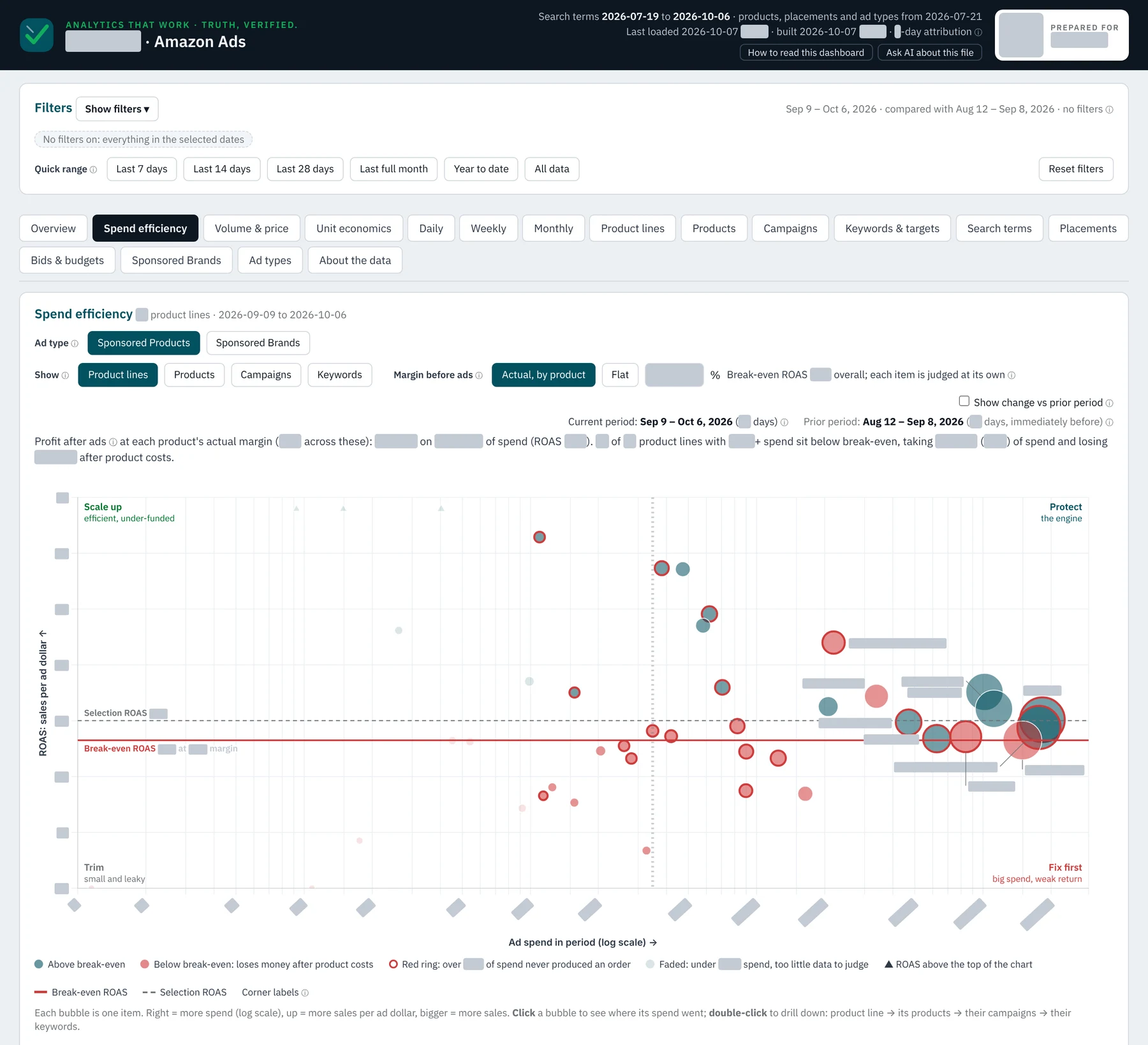
Spend efficiency bubble chart: each product line placed by ad spend and sales per ad dollar, with a break-even line from its margin and four labeled quadrants. Figures and names greyed out.
Spend efficiency. Every product line plotted by ad spend against sales per ad dollar, with a break-even line set by each item’s actual margin. The four corners say what to do: scale up, protect, trim, or fix first. Click a bubble to see which keywords and searches wasted the money.
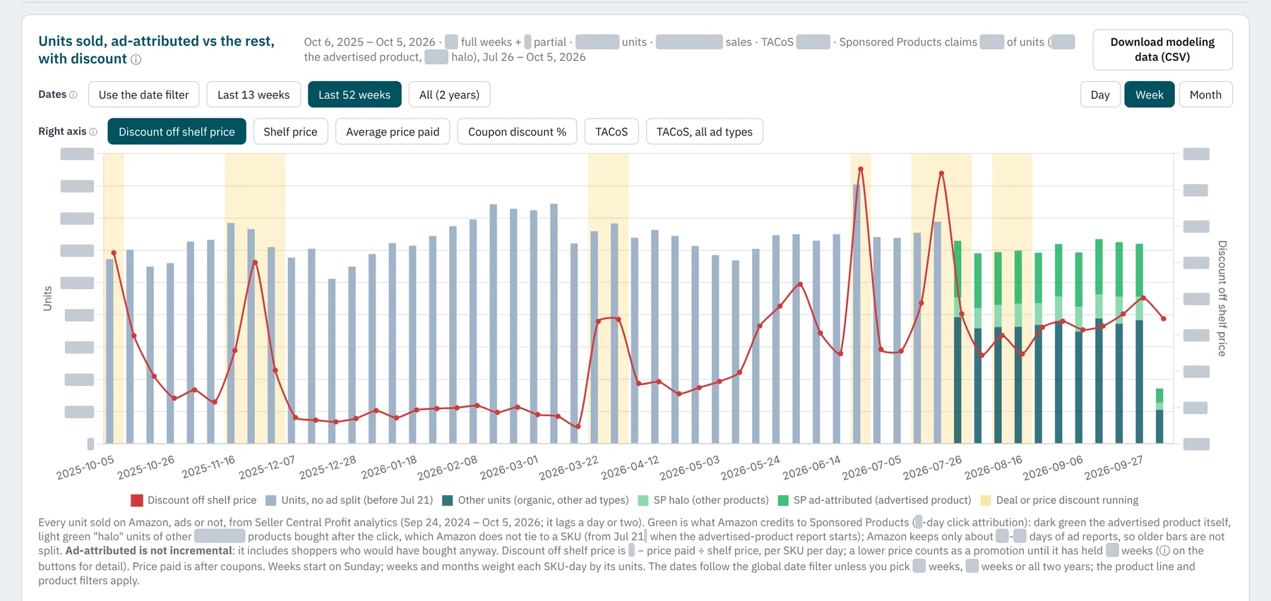
A year of weekly units sold, split into ad-attributed and other sales, with discount depth as a line and promotion weeks shaded. Figures greyed out.
Volume and price. A year of weekly units, split into what the ads get credit for and everything else, with discount depth on the right axis and deal weeks shaded. It separates the effect of price from the effect of advertising, and exports the daily data for modeling.
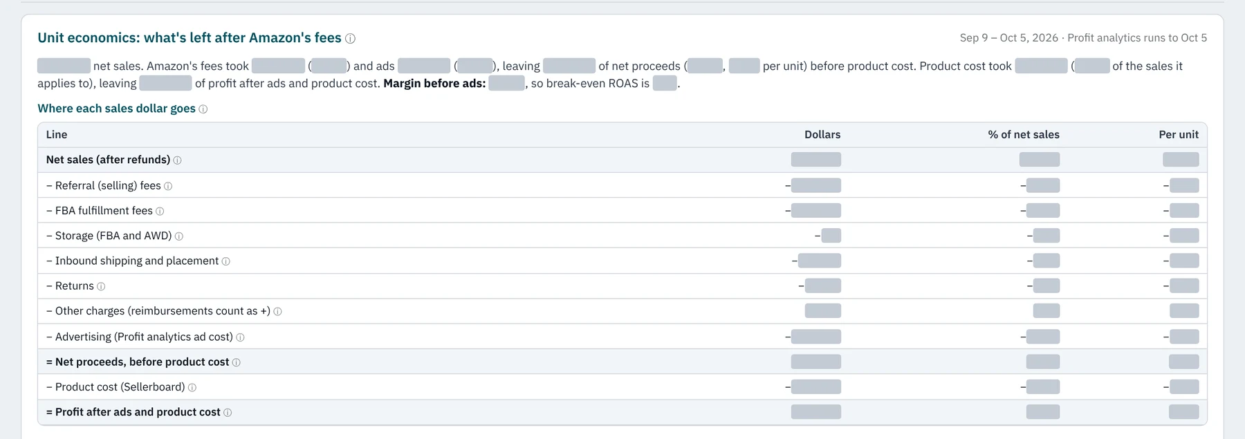
Unit economics table: net sales minus referral fees, fulfillment fees, storage, inbound shipping, returns, advertising and product cost, as dollars, percent of sales and per unit. Figures greyed out.
Unit economics. What’s left of each sales dollar after Amazon’s fees, the ads and product cost, by product line and by product.
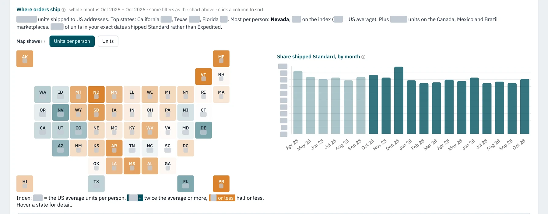
US tile map of units shipped per person by state, next to a monthly chart of the share shipped by standard delivery. Figures greyed out.
Where orders ship. Units per person by state against the US average, and how shipping speed is changing month by month.
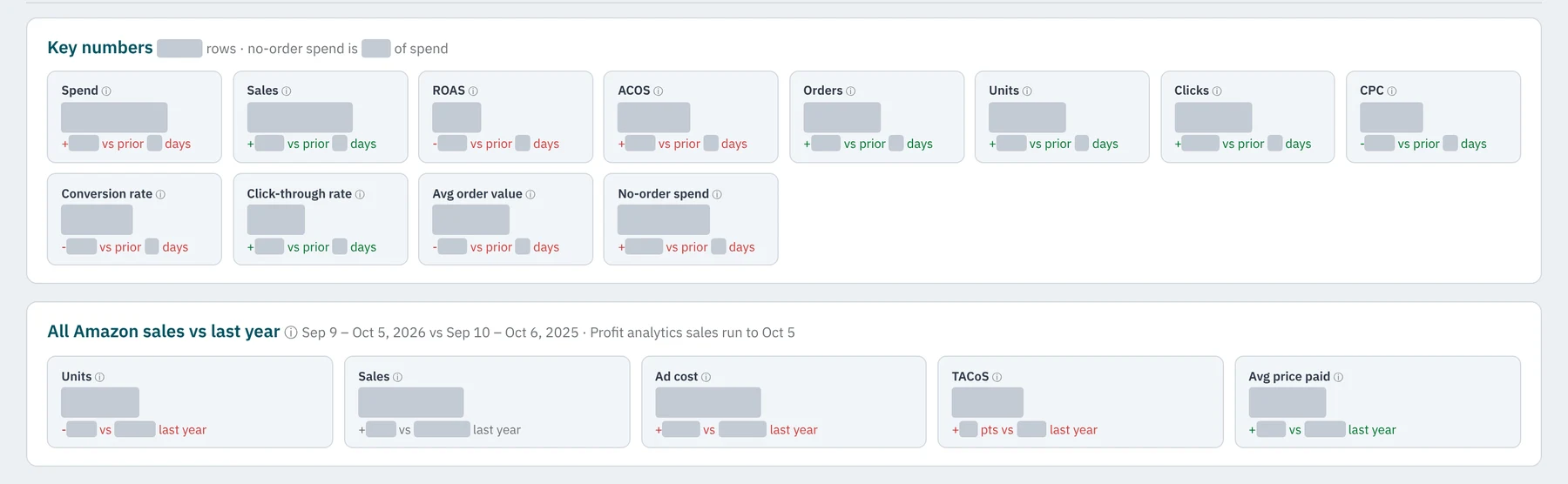
Key number tiles for spend, sales, return on ad spend, orders and more, each with its change against the prior period. Figures greyed out.
Key numbers. Each figure is compared with the period before it and with the same dates last year.
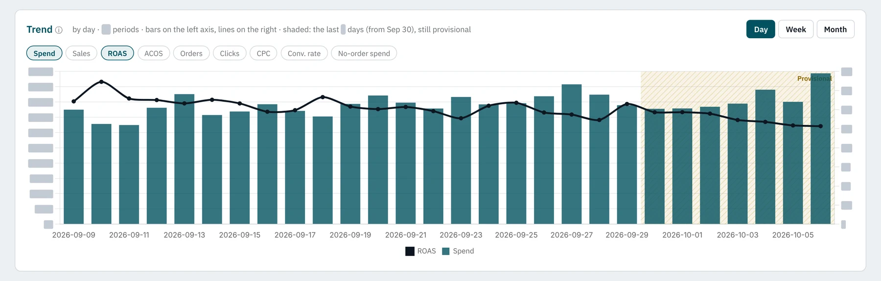
Daily trend of ad spend as bars and return on ad spend as a line, with the most recent days shaded as provisional. Figures greyed out.
Trend. The last few days are shaded as provisional, because Amazon keeps updating them for up to two weeks.
Work example · 250-location franchise network

Leaders ask the data directly

A daily revenue forecast, dashboards and an MCP connector, so managers can ask questions in plain English from their phone instead of filing a request with the data team.

Requests to the data team fell from about 30 a month to zero once people could answer their own questions.

Our product · Model Score

Every model shows its accuracy before you rely on it

The forecasting engine’s dashboard shows each model’s backtest forecasts, error by horizon, drivers and how stable they are.
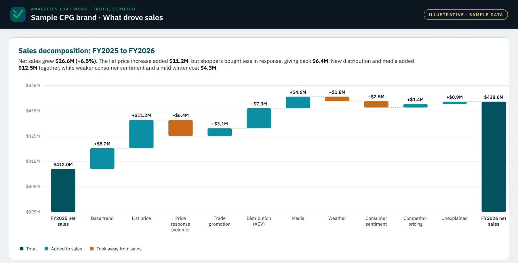
Illustrative waterfall on sample data: a consumer goods brand's year-over-year sales change split into base trend, price, volume response, promotion, distribution, media, weather, consumer sentiment and competitor pricing.
Illustrative, on sample data. What drove a consumer goods brand’s sales from one year to the next, taken from the selected model. Every driver in it has been tested for significance and overlap with the others before it earns a place.

And more

Dashboards are one way in. These are the others.

Ask from any device

An MCP connector puts your data inside Claude, so a question typed on a phone gets an answer computed from your numbers, with its definition and source.

Briefs that explain what changed

Automated summaries that say what moved, by how much, and why, so the dashboard isn’t the only place the news lives.

Files an AI can read

Dashboards ship with a guide for AI assistants: what the data is, where it sits and every definition, so answers match the dashboard.

Want one built around your decisions?

Tell us the question your team waits on most. We’ll show you what answering it directly would look like.